
Redesigning Duolingo
Tags
UI/UX
Year
2025
Duolingo is the world’s most popular language-learning app, known for its gamified approach. However, while its design keeps users engaged, it often prioritizes streaks and rewards over actual comprehension. The goal of this redesign was to strike a balance between motivation and meaningful learning, ensuring users progress in their language journey without feeling pressured or lost in unnecessary game mechanics.
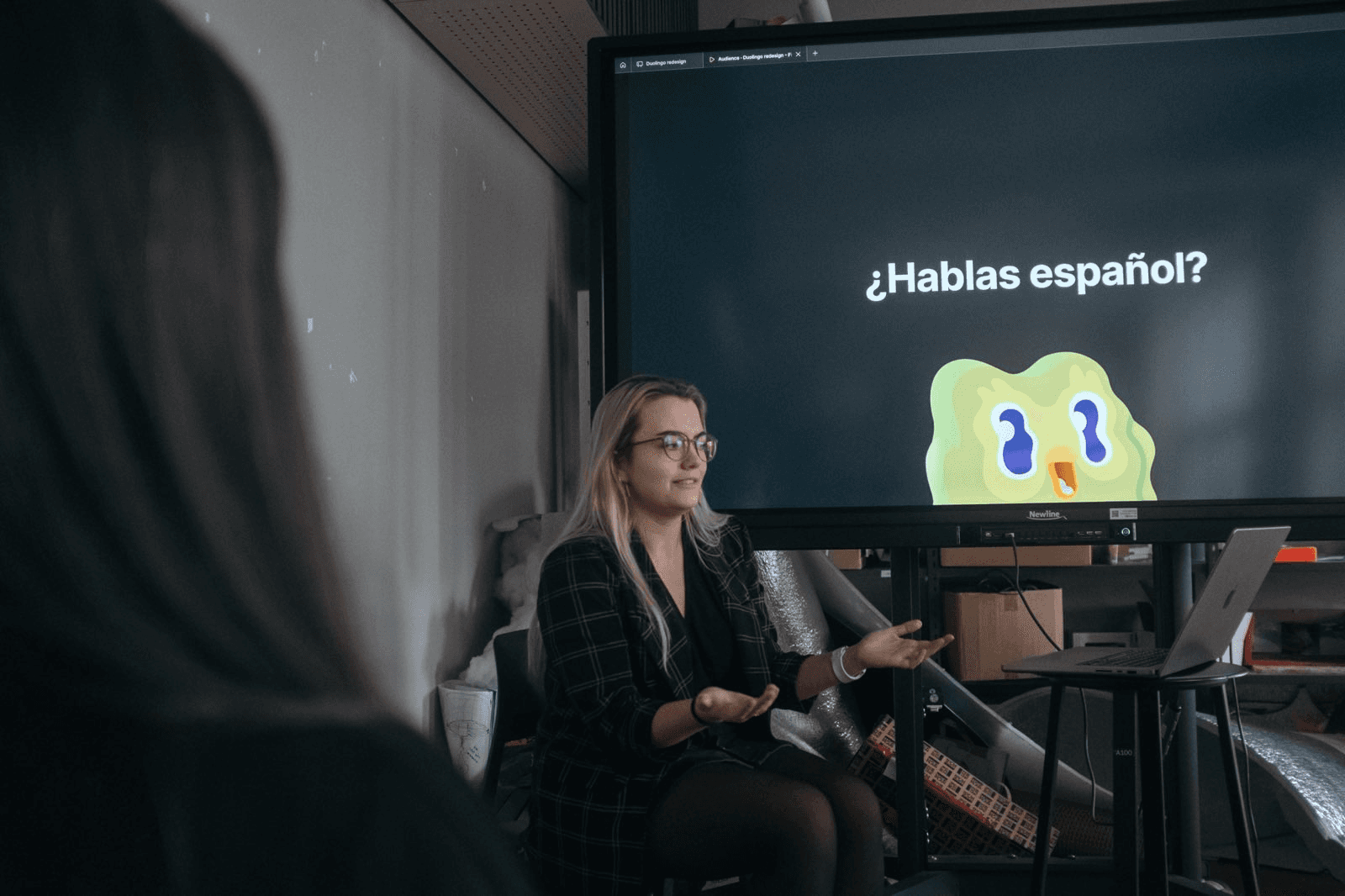
This project focused on redesigning the Duolingo app from an emotional perspective, shifting the focus from gamification to fostering a deeper connection to language learning.
Highlights
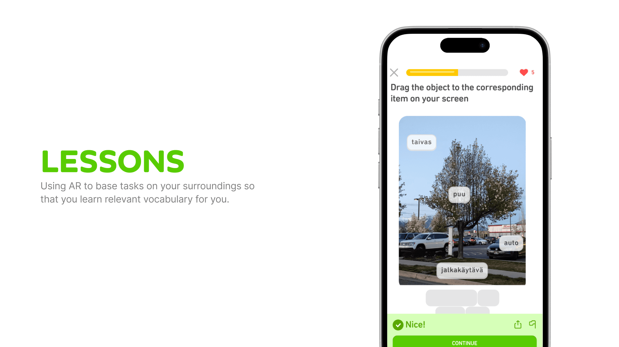
More meaningful learning paths: Lessons now adapt to user goals.
Improved navigation: Clearer structure makes learning the focus.
Better writing & speaking tasks: More flexible grading and practical conversations.
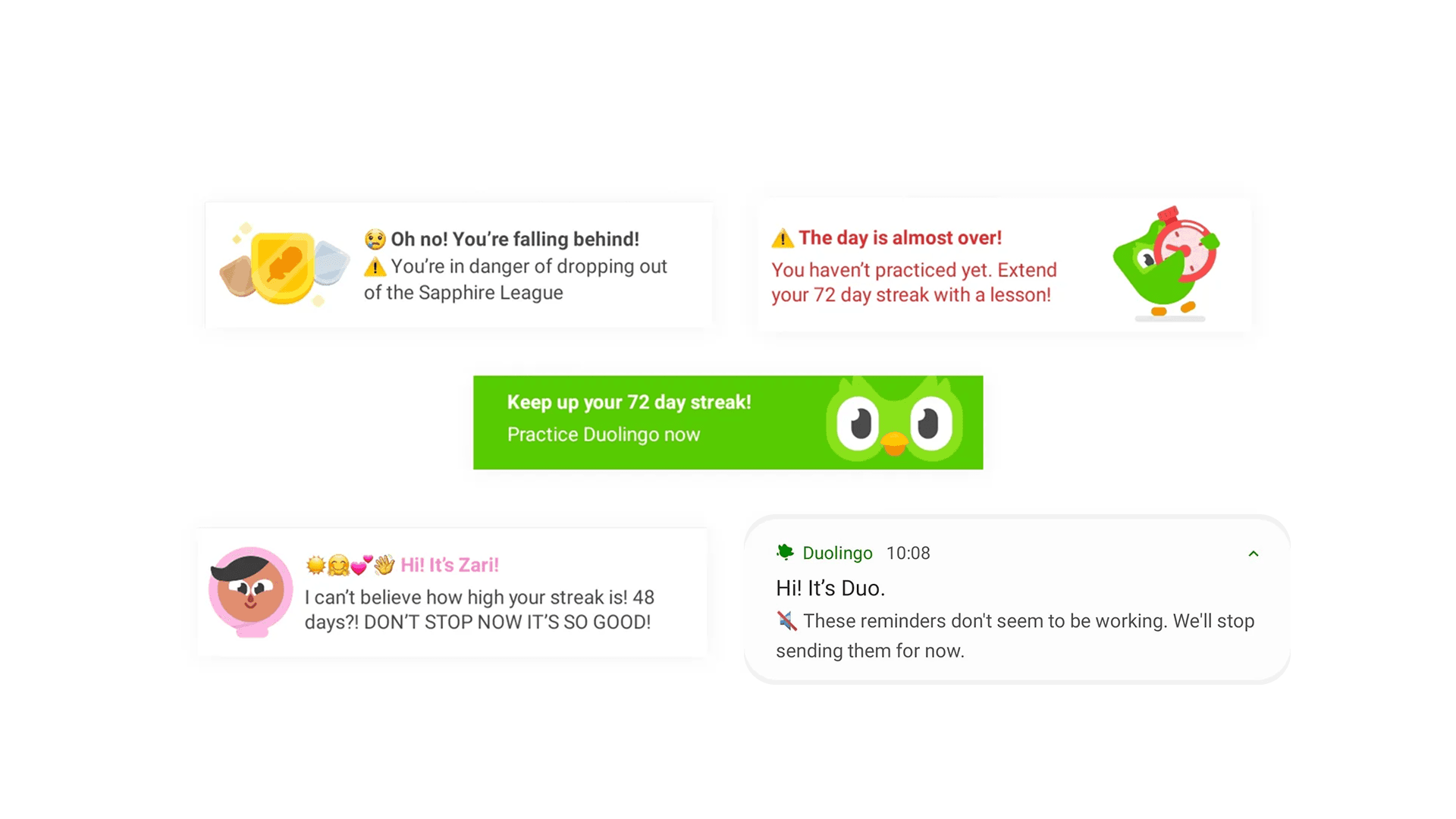
Non-intrusive notifications: Encouraging, not guilt-tripping.
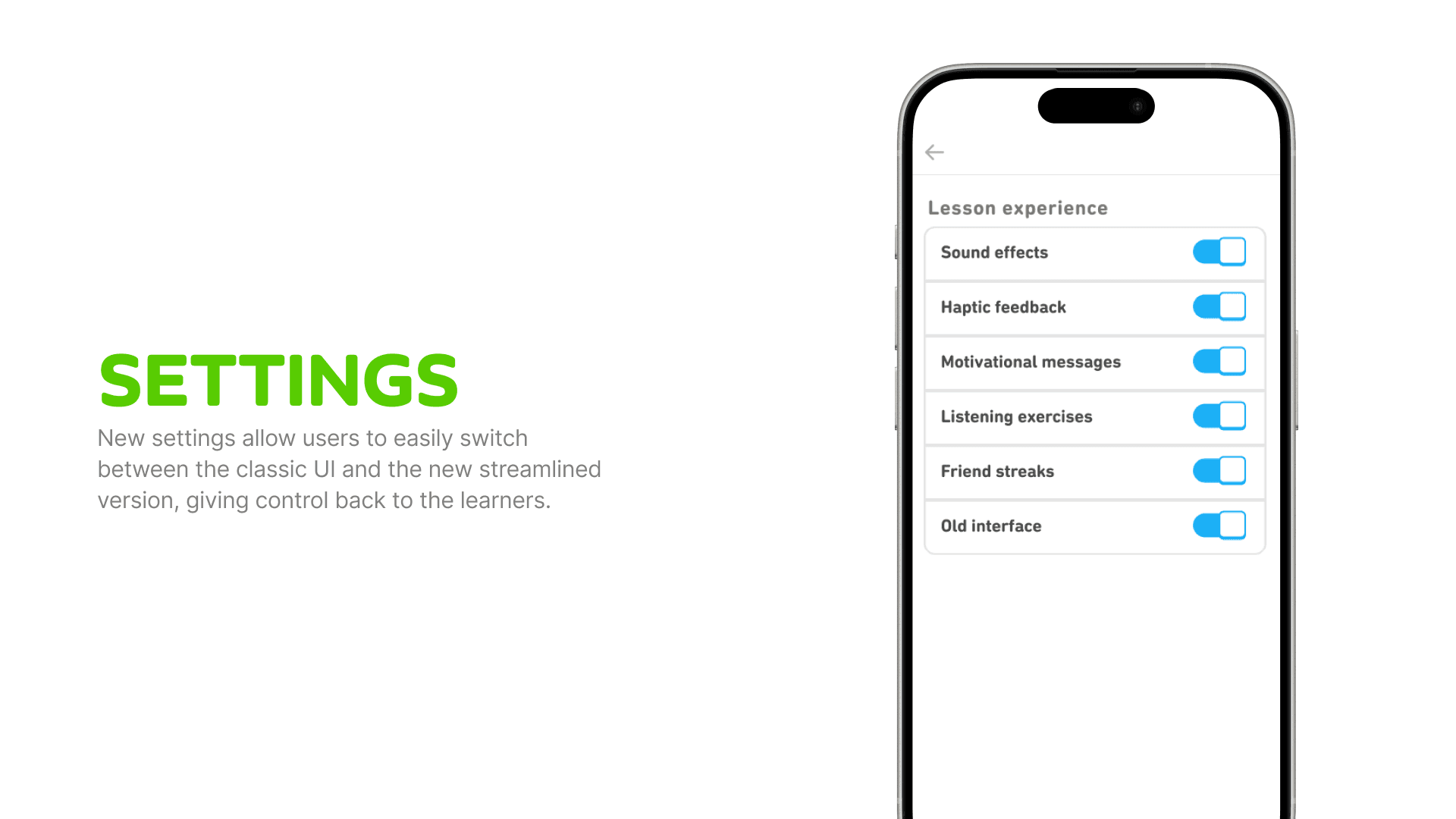
Optional UI toggle: Users can switch between old and new layouts.
Context
Language learning apps need to balance engagement and education. While Duolingo succeeds in making practice habitual, it sometimes does so at the cost of user autonomy and real progress. Users frequently express frustration with irrelevant sentences, overwhelming game elements, and manipulative streak-driven nudges.
The Problem
Gamification over learning – The app pressures users to maintain streaks and engage with leaderboards rather than helping them retain useful knowledge.

Lack of real-world relevance – Exercises often include bizarre, impractical phrases instead of focusing on real conversations.

Confusing UI & obnoxious notifications – Users feel manipulated by guilt-tripping notifications and cluttered navigation, making it hard to focus on actual learning

Inspiration & Research
Competitive & analog research: Studied how other apps balance gamification and education.
Embodied research: Went through analogous experiences to analyze how other games and apps keep users engaged without frustrating them.
Laban Movement Analysis: Examined how Duolingo’s experience feels physically—identifying stress-inducing elements.
User feedback analysis: Reviewed community complaints about the UI, exercises, and notification tone.

Solution
Choice in learning paths – Users select goals (travel, work, social), and lessons adapt accordingly.

More intuitive navigation – Clearer layout prioritizing learning over game distractions.

More real-world speaking tasks – Conversations tied to users’ chosen interests.

Smarter writing feedback – More flexible grading that allows natural word order variations.

Interest-based notifications – No more guilt-tripping; notifications highlight useful phrases and fun challenges.

UI toggle option – Users nostalgic for the old layout can switch between versions.
Design Process
I began by analyzing Duolingo’s current experience, identifying user frustrations from reviews, forums, and usability tests. I also conducted competitive research to see how other language apps balance engagement and effectiveness. Additionally, I used embodied research by playing League of Legends to understand how gamification keeps users engaged without frustration.
Based on research insights, I defined key pain points and formulated How Might We questions to guide the redesign. Sketching and brainstorming sessions led to new navigation structures, flexible writing exercises, and reworked notifications that encourage learning instead of guilt-tripping.
Using Figma, I designed interactive wireframes with a more intuitive layout, improved learning paths, new exercises, and a toggle for users to switch between the old and new UI. The goal was to reduce cognitive load while keeping engagement high in an authentic manner.
The prototype was tested with users familiar with Duolingo to gauge clarity, motivation, and usability. Feedback led to refinements in navigation, task flexibility, and notification tone, ensuring the redesign made learning more effective, less frustrating, and still fun.
Retrospective
This project reinforced that gamification should enhance learning, not replace it. While engagement mechanics are powerful, they must be used in ways that feel motivating, not manipulative. The key takeaway? Most people don’t just want to play a game—they want to feel like they’re actually learning.